A more visible backtrace & cleaner error summary

Honeybadger has launched a more visible backtrace & cleaner error summary and removed some design elements that didn't contribute anything to the app's usability.

Last week we sent out a survey to our users asking them what changes they would make to Honeybadger. We're planning on redesigning the user interface and wanted some feedback.

As we read through the responses it became clear that a lot of the things our customers were asking for could be implemented pretty quickly and easily inside our current user interface. So we're postponing the redesign for a few weeks to knock them out.

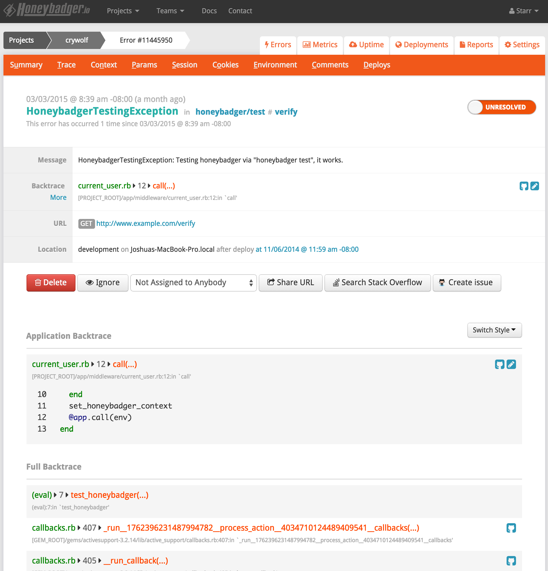
One of the most common suggestions was that we move the error backtrace higher on the page. We've just done that. We also cleaned up the error summary screen quite a bit and removed some design elements that didn't contribute anything to the app's usability.

Behold!

Honeybadger backtrace position

What to do next:
  1. Try Honeybadger for FREE
    Honeybadger helps you find and fix errors before your users can even report them. Get set up in minutes and check monitoring off your to-do list.
    Start free trial
    Easy 5-minute setup — No credit card required
  2. Get the Honeybadger newsletter
    Each month we share news, best practices, and stories from the DevOps & monitoring community—exclusively for developers like you.
    author photo

    Starr Horne

    Starr Horne is a Rubyist and Chief JavaScripter at Honeybadger.io. When she's not neck-deep in other people's bugs, she enjoys making furniture with traditional hand-tools, reading history and brewing beer in her garage in Seattle.

    More articles by Starr Horne